Our recently concluded Day class (Batch 4) campers, if not already hired, are already on their way towards employment in the Web Development field. But before that, in this post we will share our instructors’ thought on their last capstone projects: websites created using Laravel framework while applying all that they’ve learned in our boot camp.
Criteria:
- Content and Information flow – Are the information across the website well structured? (From 1 to 5)
1 – I feel lost in this website
5 – The site is well structured; Information and content are placed in their proper pages/sections
- Visual Design and Functionality – Pleasing to the eyes and other cool things (From 1 to 5)
1 – Looks like a malicious site to me (meh)
5 – Done professionally
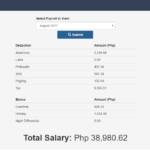
The landing page gives the user a clear idea that this website is an office tool. Despite the simple design and layout, the calculations being done and automated by this project is quite complex. Possible room for improvement is to make it possible to import a csv file instead of manually inputting the employees’ timekeeping records.
Content and Information Flow: 4.5/5
Visual Design and Functionality: 4.0/5

The ticketing CRUD system works well, and the use of AJAX when choosing departments is a welcomed addition. Changing ticket status also works fine.
Next improvements should include sorting the tickets by status, then sorting by any of the table columns, ascending or descending.
Content and Information Flow: 4.1/5
Visual Design and Functionality: 3.5/5

A social media site with the basic functionalities: friend requests, posts, comments, and likes. A lot could still be improved with the design though, and the use of AJAX is recommended, if not necessary, for projects such as this.
Content and Information Flow: 4.3/5
Visual Design and Functionality: 3.5/5
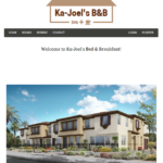
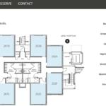
A straightforward, uncomplicated, simple to navigate bed and breakfast reservation website. There is an interactive floor plan where the user can click a room and then see its details on the right side of the screen, and pictures of the room at the bottom. Reservation can be done effortlessly. Being easy on the eyes, most users will find themselves reserving a room once they visit this website.
Content and Information Flow: 4.6/5
Visual Design and Functionality: 4.0/5
Much like the previous social networking site, this is complete with the basic functionalities: follow, posts, comments, and replies. AJAX was incorporated when posting comments. This could be improved by using AJAX as well when editing comments. We also noticed that anyone can delete comment replies, so this is another room for improvement.
Content and Information Flow: 4.5/5
Visual Design and Functionality: 3.7/5
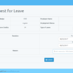
A complete system for leave filing that can be used in a company. A staff can be registered and issued with leave credits via an admin account. Once registered, the staff can log in the system and use it to file / schedule a leave, which in turn will be reflected in the admin dashboard, subject to approval. Admin can approve, deny, or cancel a leave request. The dashboard can be improved by removing the button for the current status of the request (i.e. If request is already approved, the approve button should no longer be visible.). Another possible room for improvement is to automate the update of available leave credits every time leave requests are approved.
Content and Information Flow: 4.4/5
Visual Design and Functionality: 3.6/5
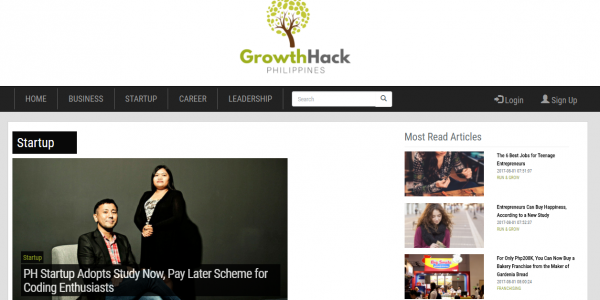
Growth Hack Philippines is a blog site for young professionals, business leaders, startup owners, or just anyone who wish to hack their way to the top of their respective industries. The blog site is complete with account registration, blog creation, tagging, and commenting. Each blog entry can be categorized under business, startup, career, or leadership. Each entry can also have multiple tags which makes it easier to find these articles using the search box.
Possible improvement is to list down the tags at the bottom of each article so that these tags can be clicked to be redirected to other related articles. Or just make sure that the right panel for “most related articles” is working.
Content and Information Flow: 4.5/5
Visual Design and Functionality: 3.7/5
The top panel gives us an idea of the main sections of the website. While the left navigation panel lays out the categories of the items that we can find/buy in the website. These two panels with the addition of the search box at the top makes it really easy for the users to find exactly what they are looking for.
Other categorizations such as hot offers, top products, and popular brands are also available. Overall, very professionally made and almost ready for market deployment.
Content and Information Flow: 4.6/5
Visual Design and Functionality: 4.2/5

A blog/review site that covers all the latest music releases, reviews, and articles by respected writers throughout the music industry. CRUD functionality is working seamlessly. The use of vinyl with black and white theme works. But we can still definitely see more improvements with the layout, for example, by eliminating most of the white/blank spaces which gives a feeling that the page is incomplete or lacking in details.
Content and Information Flow: 4.1/5
Visual Design and Functionality: 3.6/5

An Online System for students and instructor where grades can be uploaded and accessed. This is a very useful tool for educational institutions. Instructor/admin accounts can enroll students to their respective courses, and then give out grades, from first to fourth grading. The complexity of how all the grades can be given out in just one go, with the help of AJAX is applaudable. Just some more layout edits to help improve user experience and this project will be ready for release.
Content and Information Flow: 4.3/5
Visual Design and Functionality: 3.7/5
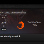
This is a sound re-implementation of an already existing system. The steps from registration, logging in, finding a match to making a bet are straightforward. Live, upcoming, and already done matches are sorted accordingly. Necessary match information, as well as coins wagered, are readily available. Just a few more minor tweaks and we can already see this deployed for wide use.
Content and Information Flow: 4.6/5
Visual Design and Functionality: 4.2/5

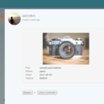
A site for sharing and indexing skate videos. There are no default categories but users (video owners and viewers alike) have the freedom to tag videos with info like: skaters involved, locations featured, tricks performed, brands represented, etc. This feature makes it a dynamic and organic website that depends solely on the community in caters to.
A painless search-and-watch experience for skate enthusiasts, this project is complete and very well developed, with its own unique identity.
Content and Information Flow: 4.7/5
Visual Design and Functionality: 4.5/5
Another Social Networking Site that gives its users a platform to vent and rant their frustrations away. As of presenting, only the CRUD for posts and comments are working (apart from user account creation), and a lot can still be improved. Page load and reload will be greatly improved with AJAX. Likes for posts and comments is a welcome improvement. There are also not much role restrictions, which enables other users to edit parts they usually shouldn’t.
Content and Information Flow: 3.8/5
Visual Design and Functionality: 3.5/5

Useful website, making it easier for users to find information about requirements for official IDs and documents, and then a blog site for important government news and announcements. Despite the seemingly uncomplicated layout, the database relationships used for the government documents and their respective requirements is pretty intricate. The gamification of this part of the project makes a rather tedious process more fun, so thumbs up!
Looking forward for this to be deployed!
Content and Information Flow: 4.6/5
Visual Design and Functionality: 4.6/5
A Social Media Site where the user can post their plans and connect with friends. There is a users page which lists down and categorizes all users, friends, and pending requests. The news feed part is well implemented with the likes and comments functionalities done with AJAX.
Functionalities are pretty much complete, and most improvements are needed on the design part.
Content and Information Flow: 3.9/5
Visual Design and Functionality: 3.6/5

A forum website inspired by Laravel.io. Forum thread creation, and categories are working fine. The CRUD functionalities are enough, and the tagging system eases the user experience. Relatively easy to navigate but could be improved by mimicking hierarchical structure of existing forum sites, as well as the placement of the web elements.
Content and Information Flow: 4.4/5
Visual Design and Functionality: 3.7/5
And that’s it! We wish you all the best in your developer careers! And don’t forget to continue learning and continue improving on your skills.

