
Recently, the Batch 2 (October2016) Day class achieved its first milestone by accomplishing their static websites written in HTML and CSS. In our previous post, we talked about their personal insights regarding the experience including the challenges they faced while working on the outputs. This time, we’ll share our instructor’s thoughts on their first milestone.
Criteria
- First impression/Landing page
- Content and Information flow – Are the information across the website well structured? (From 1 to 5)
- 1 – I feel lost in this website
- 5 – The site is well structured; Information and content are placed in their proper pages/sections
- Visual Design/Responsiveness and Functionality – Pleasing to the eyes and other cool things (From 1 to 5)
- 1 – Looks like a malicious site to me (meh)
- 5 – Done professionally
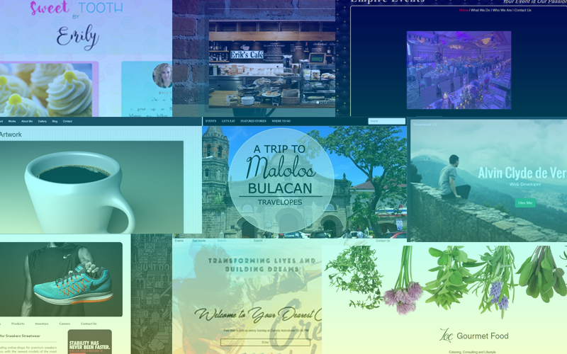
- First impression
- I can easily recognize that this website is about desserts
- Content and information flow
- Short description about baking and Emily (owner)
- Three navigation links at the top (Products, Services and Contact). These are the 3 things that I expect to know in this site.
- Room for improvement: add a short preview about the product, services and contact.
- Products page: there are two links in this page
- Cupcakes and cakes –
- And a slider (not so related to the products). It would be better if this is in the homepage
- Services: they have balloons, photo booth and giveaways
- Contact Page: contact information, google map and contact form are shown
- Visual Design
- The look and feel is consistent throughout the site
- Font is somehow hard to read
- The product/service gallery functionality is great!
- The images are somehow slow to load — use smaller images
Verdict
- First Impression: 3/5
- Content and Information Flow: 3.8/5
- Visual Design and Functionality: 3/5
- First impression
- It’s a church website – emphasized by the slogan, “Transforming lives and building dreams”
- Minimalist landing page
- Content and information flow
- Landing page is great! Only the basic information is shown until you click “Enter”
- Homepage:
- There are three featured articles with only the title and the first paragraph. Good!
- The next sections are Connect to a Cell, and Who we are
- Footer: Contact information, social media, contact form and the latest blog posts
- The links in the blog posts can be moved to another section instead of the footer.
- Events page – very organized
- Get involved page – very organized too
- Visual Design
- Improve readability by making the background image more “faded”
- The images improve the experience instead of all words and paragraphs but avoid stretched images
Verdict
- First Impression: 4.3/5
- Content and Information Flow: 4.2/5
- Visual Design and Functionality: 4/5
- First impression
- A tourism website about Malolos
- Summarizes what is happening in Malolos right now.
- Content and information flow
- In the landing page is a picture/banner
- Below the homepage is the different sections that tells us about Malolos, on upcoming events, areas of interest (where to eat) and the awaited events
- Add a link from the homepage to the featured page of the event/area
- The lower section seems to be too crowded for a three column layout.
- Events page – it highlights a single event followed by other events in the lower sections
- Places to eat – no featured place (all have the same emphasis) but the links to other places on the sidebar are redundant since they are on the Places to Eat page
- Visual Design
- The site is very consistent with the design along with responsiveness
- The images on the site greatly help in providing information
- The combination of articles and images are in perfect balance
Verdict
- First Impression: 4.3/5
- Content and Information Flow: 4/5
- Visual Design and Functionality: 4.2/5
- First impression
- A coffee shop
- The slideshow is not properly aligned
- Content and information flow
- The homepage starts with the introduction about the café.
- There is a separate page for About Us. The content in the homepage could be shortened and the remaining can be moved to the about us page
- Visual Design
- Too many colors in the design
- A sans-serif font would be better
- Improvement for the top navigation bar
- Improvement in the alignment of the elements
Verdict
- First Impression: 3/5
- Content and Information Flow: 3/5
- Visual Design and Functionality: 2.7/5
- First impression
- This website is all about shoes.
- Content and information flow
- banner about shoes followed by a description about the footwear
- The next section, Our Top Brands, is a good choice as this website aims to sell shoes.
- Visual Design
- Layout and theme is good.
- Brand logos can be used instead of just the texts
Verdict
- First Impression: 4.1/5
- Content and Information Flow: 3.7/5
- Visual Design and Functionality: 4.3/5
- First impression
- It takes a little while to recognize what this site is all about until I saw the header
- Content and information flow
- It’s a long single scroll page.
- The things that a portfolio site needs are present. Self-introduction, portfolio and contact information.
- Since it’s a portfolio site, About Me, Featured, Works, Gallery, Blog and Contact would be a better order.
- Visual Design
- The design is simple and neat.
- The about me section can be further improved by converting the paragraphs into a bullet form for easier reading
Verdict
- First Impression: 3/5
- Content and Information Flow: 3.7/5
- Visual Design and Functionality: 4.2/5
- First impression
- Food site delivery
- Content and information flow
- Divided into: home, menu, gallery, about and contact
- The menu and gallery can be integrated into a single page
- Visual Design
- Simple but allows for more creativity for the overall look and feel
- Plus points for gallery functionality with pop-up.
Verdict
- First Impression: 4/5
- Content and Information Flow: 3.8/5
- Visual Design and Functionality: 3.5/5
- First impression
- Food site
- Content and information flow
- The site is divided into 4 pages: home, what we do, who we are, contact
- The homepage did a good job by providing only a short description and keeping the rest in the about page
- The What we do page perfectly presents the info. Starts with a short paragraph about their services followed by a list
- The “What we do” can be changed to “Services”
- Visual Design
- Simple but allows for more creativity for the overall look and feel
Verdict
- First Impression: 3.4/5
- Content and Information Flow: 4.5/5
- Visual Design and Functionality: 3/5
- First impression
- A personal website about self
- What does the “Hire me” button do?
- Content and information flow
- The order of information is perfect. Short introduction about self, followed by skills, educational background and portfolio.
- Visual Design
- Straightforward in delivering the message
- Representing the Education section and Work experience can be improved using icons.
- Links not working
Verdict
- First Impression: 3/5
- Content and Information Flow: 3.7/5
- Visual Design and Functionality: 3.7/5
…and that’s a wrap! Overall, our instructor had this to say to everyone:
- Job well done on your first website!!!
- Web development is both logic and art.
- The About page can be moved out of the landing/homepage if it is not the main objective of the site
- Check out other similar sites for ideas and inspiration